A Designer’s Ongoing Truce with the Grid
Designing with a grid is like playing chess with yourself. You set up the board, you lay down the rules, and then—inevitably—you start looking for ways to bend them.
Every designer has that moment: the rush of seeing a grid line up perfectly with type, image, and whitespace. It’s geometric harmony. It’s grown-up LEGO. But the grid isn’t just a tool. It’s a philosophy. A discipline. And occasionally, a straitjacket.
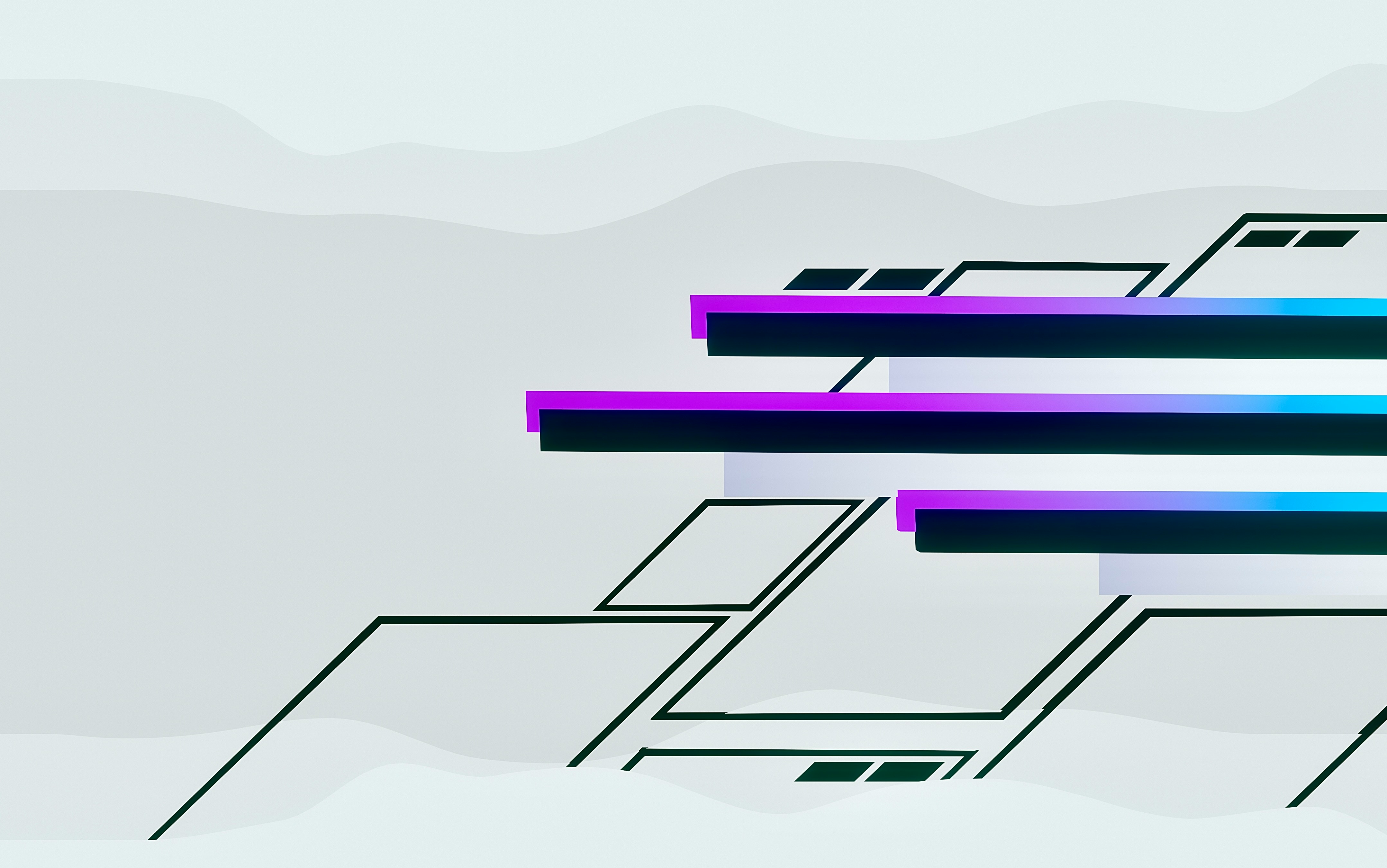
Lately, I’ve been thinking about what it means to design with just enough structure. Not too much to strangle the spontaneity, but not so little that the design drifts into chaos. This site redesign I’m working on? A classic case. I started with a beautifully over-engineered 12-column CSS grid—flexible, elegant, obsessive. And almost immediately, I started breaking it.
Grids as Promises (and Threats)
At their best, grids are promises: to align, to guide, to unify. But they’re also threats. Because once you define a structure, you commit to it. Every deviation becomes a question. Is this a mistake, or a decision?
I’ve decided to treat my grid like scaffolding, not scaffolding plus internal walls plus ductwork plus floor plan. Just the part that holds things up long enough to figure out what the building wants to be.
I’ve opted for a twelve-column base grid not out of devotion, but pragmatism. Twelve is generous—divisible by 2, 3, 4, and 6—which means I can carve out space like a butcher with too many knives. I use only what I need. Most often, I subdivide into fours or sixes, keeping the rest in my back pocket like loose change.
On Mobile, Everything Melts
The great web design paradox: structure wants to be solid, but the canvas is jelly. That beautiful grid you composed on desktop? Reduced to vertical soup on a phone screen.
Hierarchy—the sacred order of design—gets flattened like a bad soufflé. So you adapt. You prioritize font sizes, weights, spatial rhythm. You accept that mobile-first often means emotion-last.
But I’ve come to enjoy the game of adaptation. Start with an expressive desktop design, then chisel it down. There’s something beautiful about preserving energy across breakpoints. Design, after all, is a translation, not a replication.
Visual Poetry in Metadata
I’ve been redesigning two key pages: Reading and Listening. Formerly dry lists, now they’re more like typographic playgrounds. Album covers, book jackets, splashes of color. I realized that metadata—titles, names, numbers—can be as expressive as imagery.
I caught myself doing something weird, though. With albums, I naturally listed title first, artist second. With books? Author first, title second. Why? No idea. Some deeply buried cultural pattern, probably. Or maybe the part of my brain that still remembers card catalogs.

Consistency won. I now go title first, always. Lizard brain silenced—for now.
The Problem with Perfection
Here’s the part no one tells you: the grid will always look better in Sketch or Figma than it will in the browser. In a static comp, the space is perfect. In code, it’s alive—and a little bit unpredictable.
I’ve been nudging spacing, swapping font sizes, adjusting image flow. That’s where the fun is. Design isn’t about perfect templates. It’s about negotiation. With content, with devices, with the way light hits your screen at 3 p.m.
Color as Compass
To help each section of the site breathe, I’m introducing subtle background color shifts. Nothing wild—just a soft wash to guide the eye and mood. Off-black for music. Cream for books. Tints that nudge your subconscious toward a context.

The overlays use semi-transparent layers that pick up the hue beneath. Like a glaze on a painting, this softens edges and creates a cohesive visual fingerprint across the site. It’s subtle. It’s quiet. But it feels intentional.
In the End, A Grid is a Starting Point
Design is not a grid. It’s what you do with a grid. The structure is invisible when it works. And when it doesn’t—well, you feel it, even if you can’t name it.
This redesign? It’s a handshake between logic and impulse. The grid says, “Let me help you.” And I say, “Only if you don’t get in my way.”
The relationship continues.