A Comprehensive Guide to the 14 Principles of Design
Design is often considered subjective—what’s beautiful to one person may not be to another. Yet, when it comes to creating a website that reflects your brand and engages your audience, certain principles of design can guide your decisions to ensure a balance of aesthetic and function.
In this guide, we’ll walk you through 14 key principles of design, explaining why they matter and how you can apply them, particularly in the context of web design.
What Are the Principles of Design?
The principles of design are foundational guidelines that help you arrange, organize, and style the elements of any visual project. These principles work together to ensure that your design is clear, cohesive, and visually appealing.
Think of them as your toolkit for creating compelling user experiences—whether you’re designing a brand, a web layout, or a graphic asset.
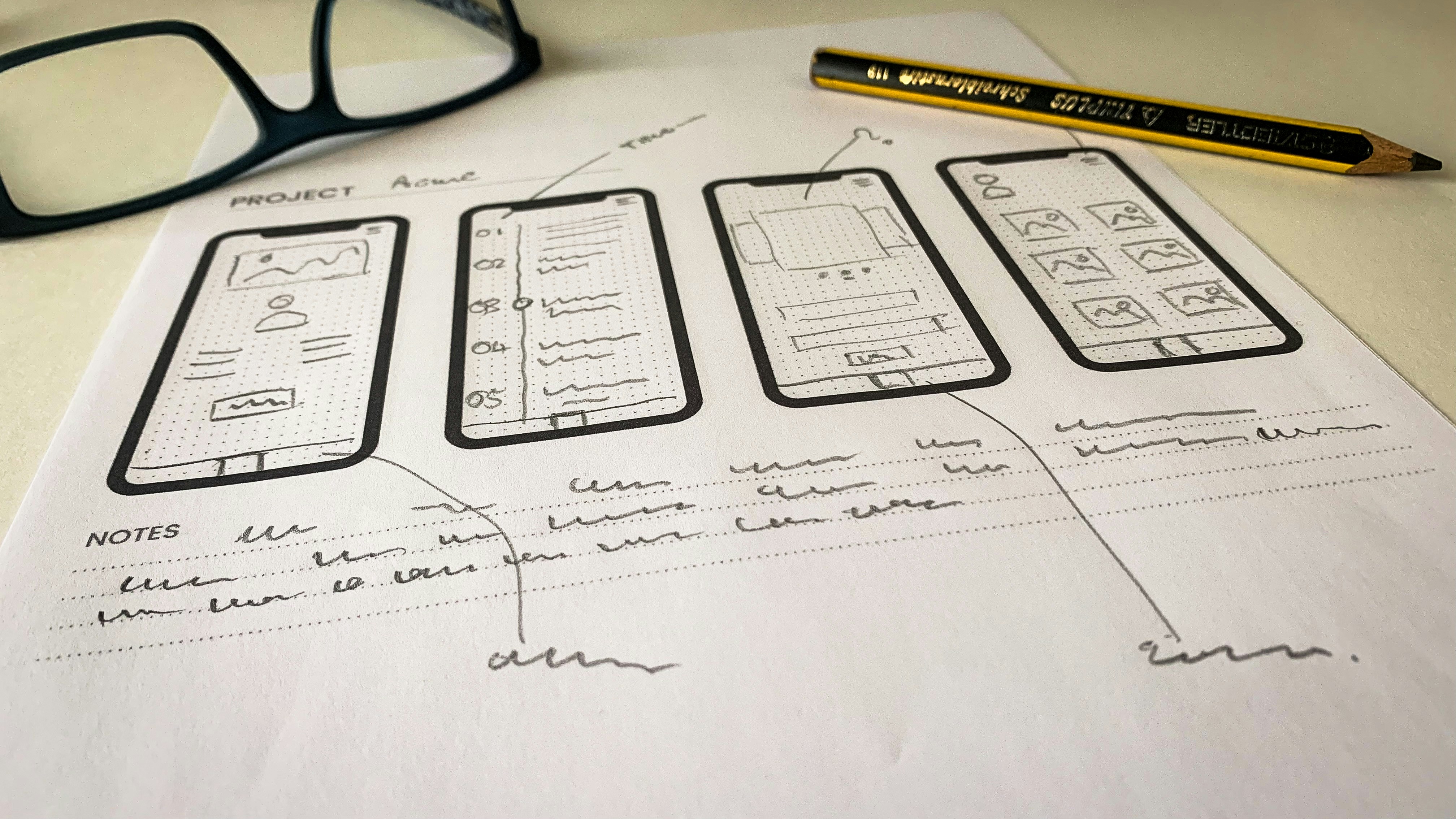
The 14 Principles of Design
01. Balance
Balance refers to the even distribution of visual elements in a composition. It creates a sense of stability and structure.
- Symmetrical balance creates mirror-like equality.
- Asymmetrical balance offers a dynamic and modern aesthetic, especially useful in responsive web design.
Tip: Use white space or smaller elements to counterbalance heavier visuals.
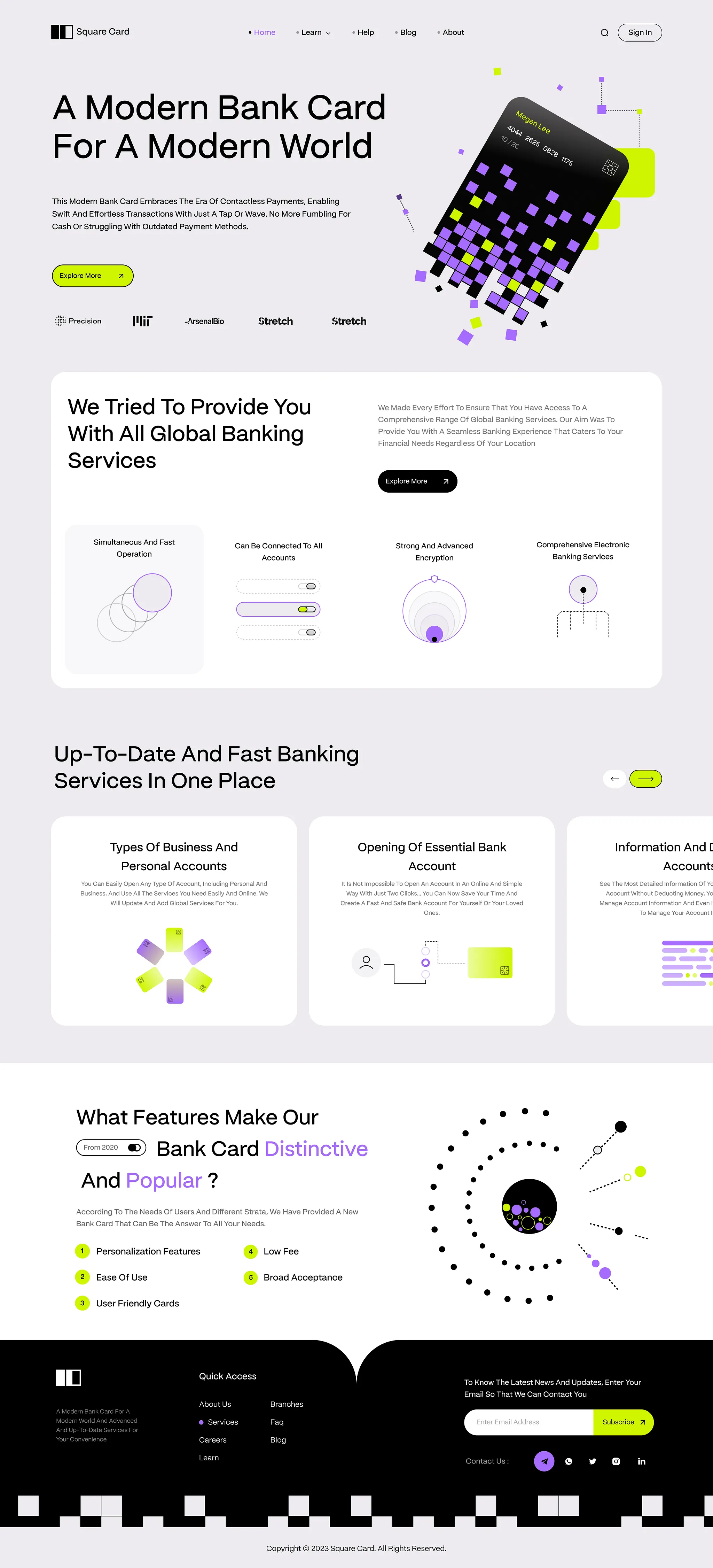
02. Variety
Variety prevents monotony by incorporating diverse elements—colors, shapes, sizes, or textures—while maintaining cohesion.
Tip: Balance variety with unity by using recurring design motifs or color themes.
03. Contrast
Contrast is about pairing opposites—like light and dark, big and small—to create emphasis and visual interest.
Tip: Use contrast to highlight calls-to-action or essential information.
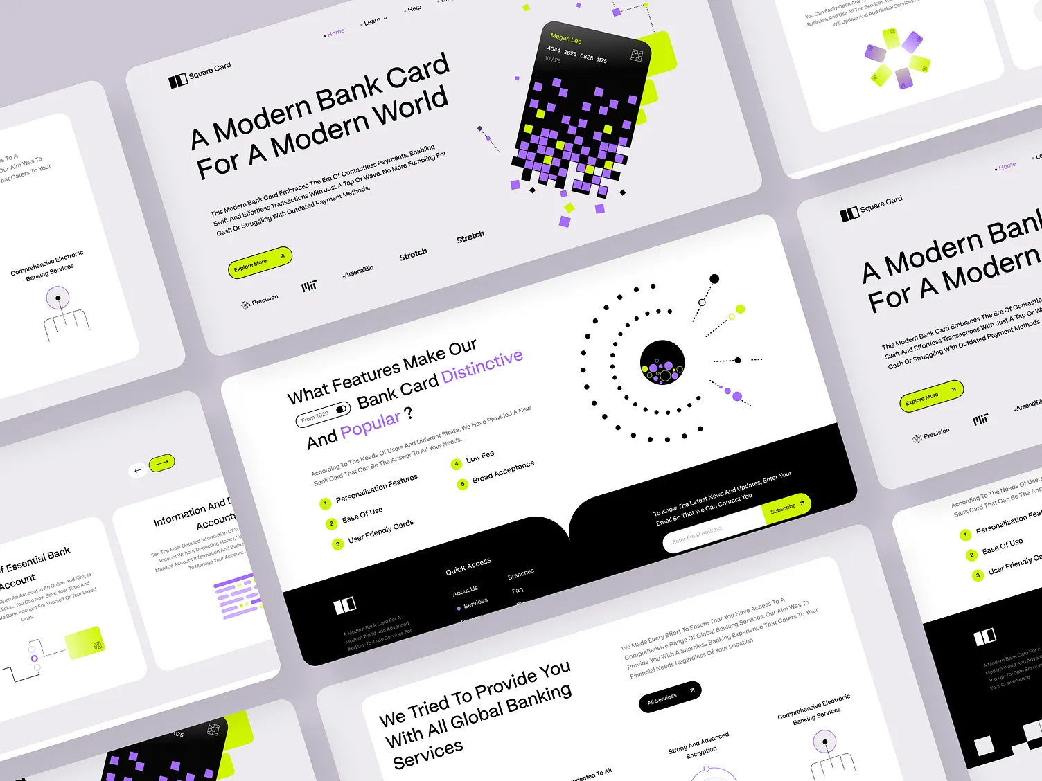
04. Alignment
Alignment ensures that elements are visually connected and well-organized.
Tip: Use grid systems to maintain consistent alignment and enhance readability.
05. Movement
Movement guides the viewer’s eye across the design, creating a flow and narrative.
Tip: Use directional cues like arrows, lines, or animated elements to lead the user.
06. Scale
Scale adjusts the size of elements to establish relationships and importance.
Tip: Use larger elements for focal points and smaller ones for secondary details.
07. Proportion
Proportion deals with the size relationships between elements. Balanced proportions create visual harmony.
Tip: Use proportion to establish hierarchy and group elements meaningfully.
08. Emphasis
Emphasis draws attention to the most important elements by making them stand out.
Tip: Highlight key content using color, size, or unique positioning.
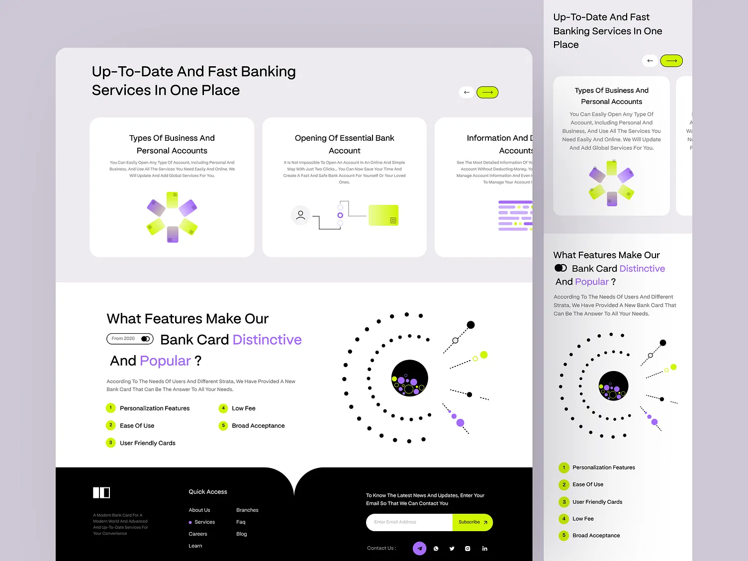
09. Hierarchy
Hierarchy organizes content in order of importance to guide the viewer’s attention.
Tip: Use varying font sizes and strategic placement to structure content effectively.
10. Rhythm
Rhythm creates a sense of organized movement through repetition or pattern.
Tip: Establish visual rhythm using consistent spacing and recurring motifs.
11. Unity
Unity ensures that all elements work together as a cohesive whole. It strengthens brand identity and visual flow.
Tip: Use a consistent color palette, typography, and spacing throughout.
12. Space
Space—both positive (occupied) and negative (empty)—is crucial for readability and focus.
Tip: Embrace negative space to let your design elements breathe.
13. Repetition
Repetition reinforces concepts and visual themes by reusing design elements.
Tip: Use repeated styles for buttons, headings, or icons to build familiarity.
14. Proximity
Proximity groups related items together to indicate their relationship and organize information.
Tip: Keep related text or visuals close together to improve comprehension.
Conclusion
The principles of design aren’t rigid rules—they’re strategic tools that help you communicate more effectively through visual design. Mastering them can take your web design (and any visual project) from good to great, ensuring both functionality and beauty in your work.
Use them wisely, and your designs will not only look good—they’ll work well, too.
